The first cafe of Easy Soup (a healthy fast food chain) opened in Minsk in autumn 2018. A new visual design system has been developed for it specifically for the Belarusian market. The brand strategy and design were covered by Fabula Branding, and the architectural solution was implemented by the team of Nikoengineering.

The Concept
Easy Soup represents the format of fast casual which is extremely relevant today. Fast casual brands support and develop a balanced approach to nutrition and combine express service (typical for fast food) with the benefits of healthy food.
How did the concept of the business affect the design? First of all, the simplicity, convenience, and naturalness typical for this format had to be reflected in the corporate style using colours and other visual means. Secondly, as the points of sale were expected be located in malls with high levels of informational noise, all design elements had to be quickly and easily readable. Thirdly, the new point of sale would offer over 60 types of soup with the product range changing every week. Therefore the design solutions for the menu, branded ware, and other media had to emphasize different tastes of various positions but still remain universally applicable. And so on.
Emotional barriers also had to be taken into account. Soup still remains a home or, at best, a lunch dish. The wide audience used to disgusting soups from school canteens is only starting to understand that soups can be tasty, healthy, and now also convenient. When opening a fast casual sales point in the era of fast food and street food, one has to educate the customers about healthy nutrition and at the same time not to repel them with dullness.
Kirill Borokhov, caterer:
The international trend of healthy food is now coming to Minsk, but our city still lacks projects in this segment, let alone in the fast casual format. We felt a change in market trends, took into account our own needs, and tried to understand what the city craved for. But it is always important to present the information correctly. When planning to open our sales point in a mall, we realized that food courts are occupied by major active players. People that come to food courts make decisions about what and where to eat in split second, that is why it is important to explain the idea of the place and to show our advantages clearly and quickly.


The Identity
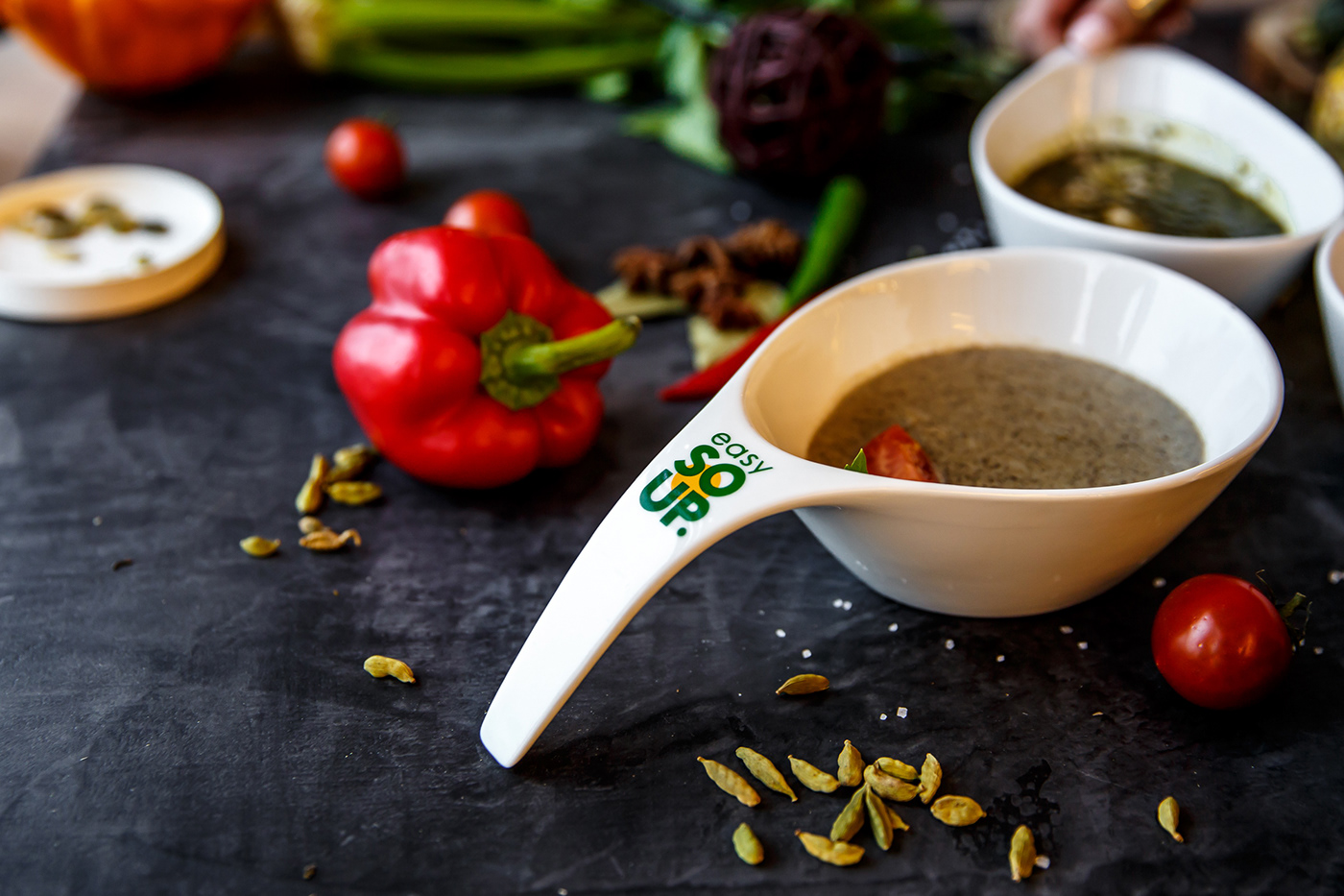
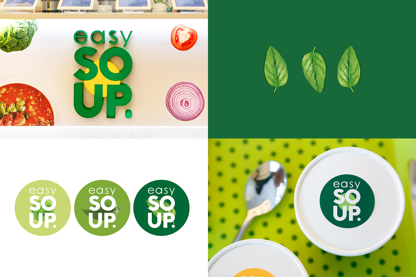
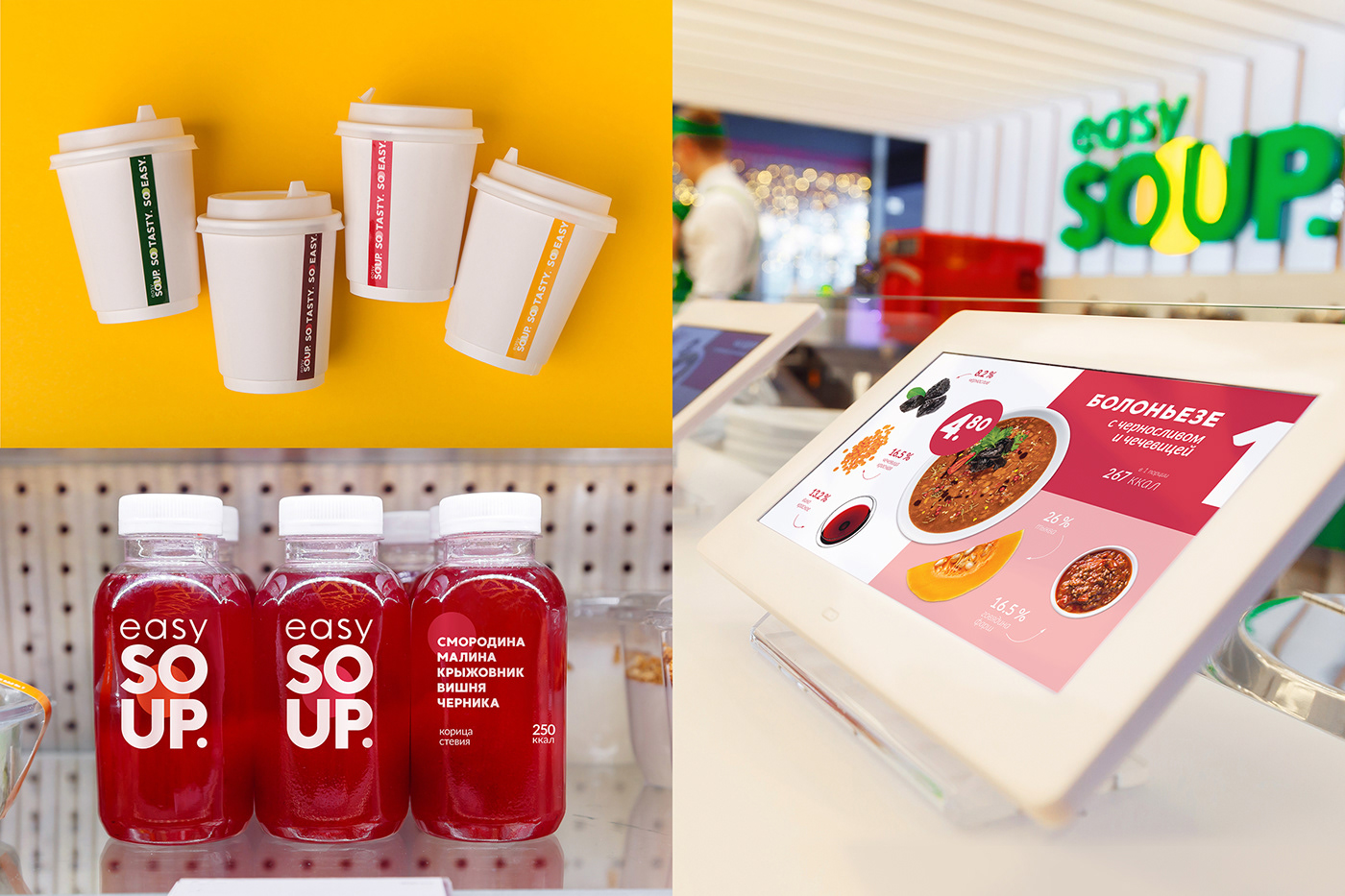
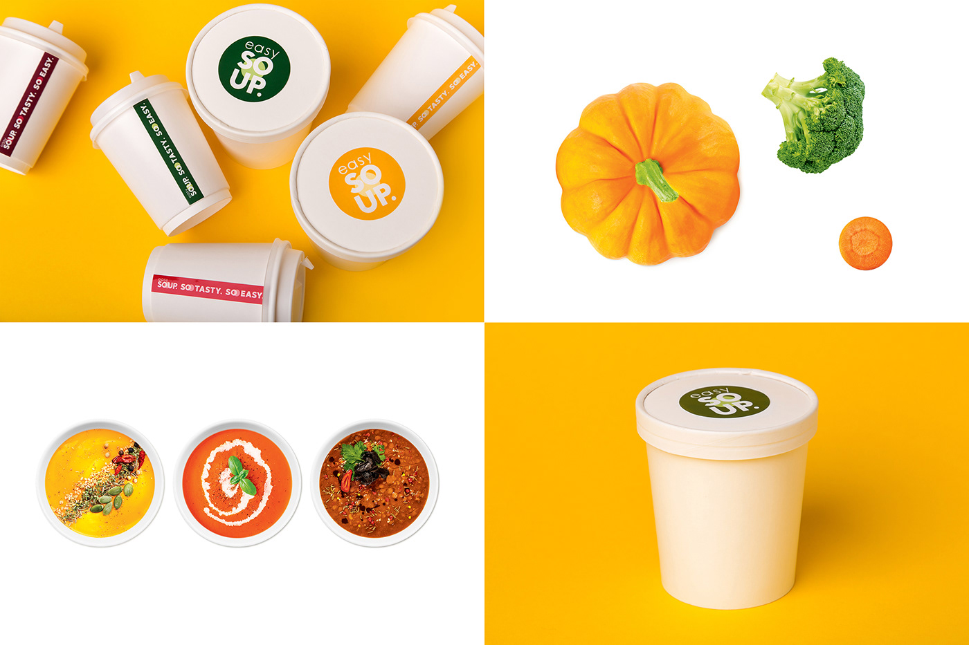
When developing the logo, we naturally thought of a bowl of soup and the shapes of the products it consists of. This idea can be traced in the graphic images and lettering. The colours of the logo — healthy green and tasty yellow — illustrate the idea of balanced nutrition the whole concept of the place is based on.
The bright food palette shows the variety of ingredients, and the photorealistic images demonstrate their attractiveness and taste. A colour corresponding to each product emphasizes each taste position preserving the recognizability of the brand. And if the ware is transparent, its content literally becomes the background of the logo.
Dmitry Kashkan, managing partner at Fabula Branding:
It was important for us to show the expert component of the brand. Easy Soup is a place where tasty and healthy food meets fast and quality service. Each step, each menu position are though through and balanced to make good recipes available to everyone. The idea of fresh ingredients and natural products serves as the basis of the corporate style and is included into the design of branded media: digital panels, ware, stand details, and other elements.
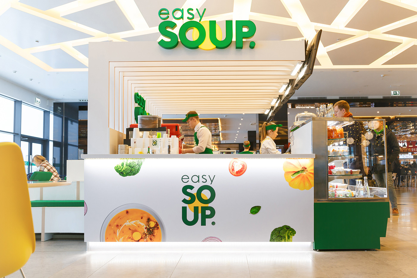
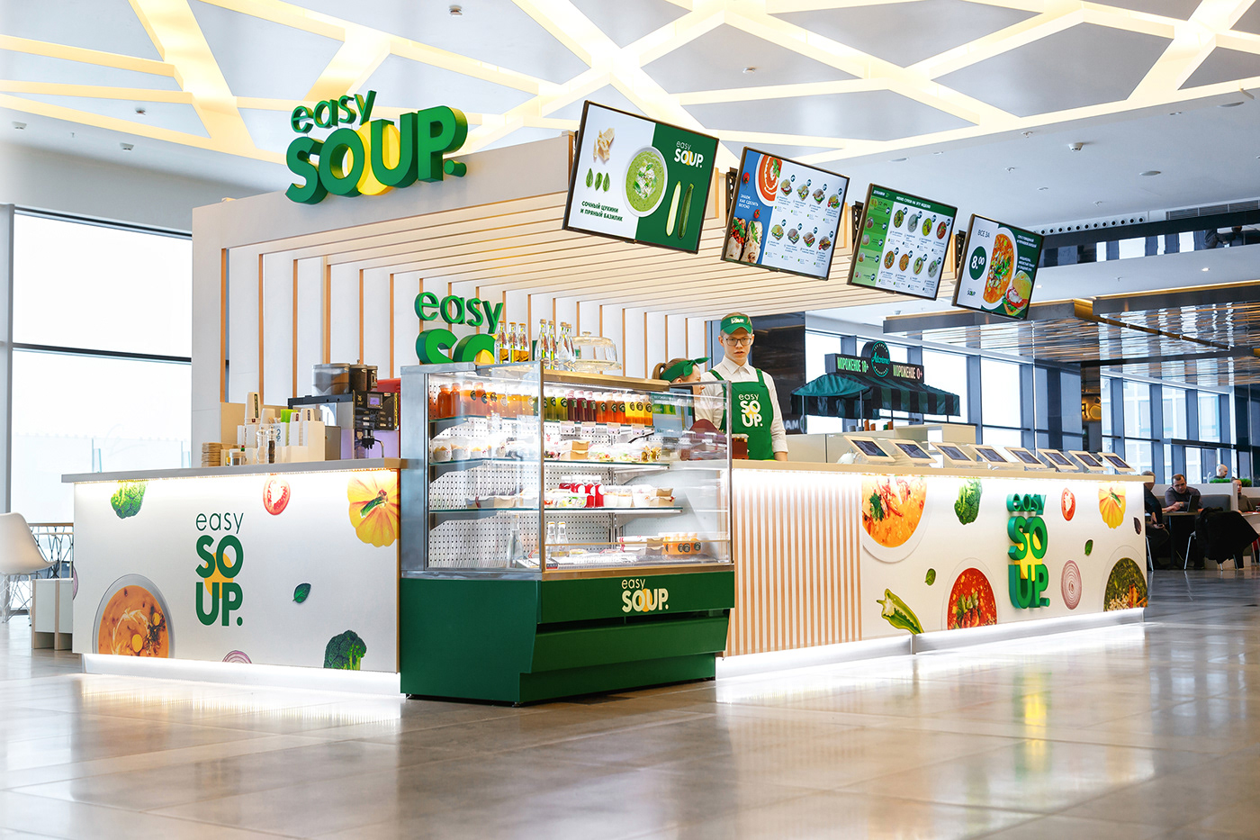
The Branding of the Retail Environment
When developing the design of a small food chain point, it is important to combine in harmony the architectural solution and the constants of the corporate style (in our case these are laconic shapes and natural colours). The design of a sales point was developed in line with these principles, and materials, colours, and surfaces were selected accordingly.
The first balanced nutrition point of Easy Soup opened on the 6th level of Galleria Minsk, in the center of the food court. This location has both its advantages and disadvantages. The pop-up point is separated from the stands of its competitors, but this retail format requires unusual solutions to use the space to maximum efficiency and to communicate the brand’s main values.
Dmitry Kulakevich, head of Nikoengineering:
The architectural concept of the Easy Soup sales point at Galleria was created by our colleagues from Zrobim Architectural Bureau. It is a stepped podium uniting the sales point module with public space. Our task was to make this beautiful architectural solution work as an efficient retail object. We had to locate all necessary equipment within a quite small stand, to make it visually attractive, informative, functional, and safe. Digital menu panels and lighting are placed on light console lamels that serve as an additional barrier between the staged podium and the surrounding space. To store and heat the soups, Easy Soup uses high-tech inductive steam tables that have previously been seen in Minsk only in 5-star hotels. And to make coffee and cook hot sandwiches, the company relies on the same equipment as Starbucks. Easy Soup is not only tasty and healthy, it is also cutting-edge!